

Building brands that matter
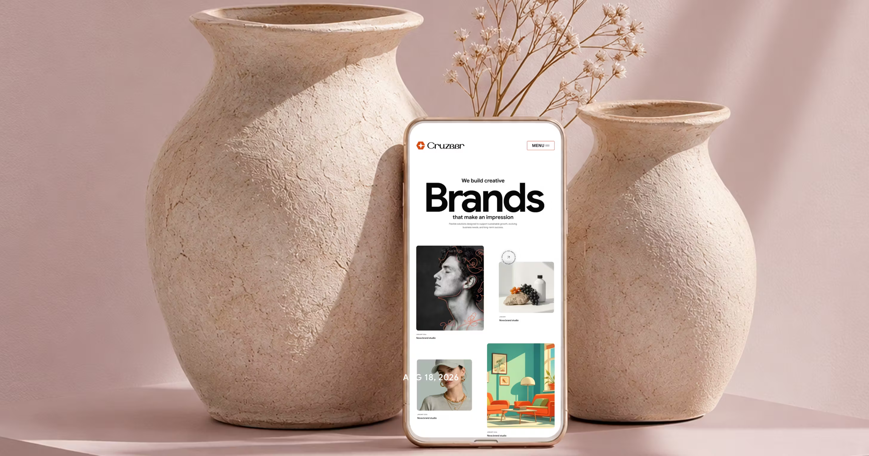
A brand that matters is one a person recognizes without being told. No logo in the corner, no name in the headline, and still the page is unmistakable. That recognition is a design outcome, not a marketing one.
Most of a brand budget goes to the parts a customer sees once. The parts they see every visit, the ones that build recognition, are decided quickly in a build and rarely revisited.
Where a brand actually shows up
Open any site and the brand arrives before the copy does.
Line height, the width of a text column, the pause before an image resolves, the shape of a button under a thumb. A visitor reads none of these consciously and remembers all of them. They are set by designers and developers in an afternoon, usually with less discussion than the logo got in a year.


Pick the cues that carry recognition
Few cues repeated everywhere beat many used once.
Choose the ones a person meets on every screen. The corner radius on every card, the one weight the headings never leave, a single accent that appears in links and nowhere else. Repetition is what turns a preference into recognition.
The test is a screenshot with the wordmark cropped out. If the page could belong to a competitor without anyone noticing, the cues are not doing any work.
Name a color for its job
In the file a developer opens, a color named accent survives the day the palette changes and a color named blue does not. The same holds for a spacing step called gutter rather than sixteen, and a type role called intro rather than large. Naming by intent lets an identity shift without a rename touching every template.
What a rushed build drops
Nothing on a rushed page is deliberately made generic.
Custom photography goes first, because someone has to grade every image. Then the wordmark loses its lockup and gets typed in the interface font. The layout survives. The signature does not.
What ships works fine and looks like the template it started from, because every part that carried the identity was the part that cost time.
Hold something still through every revision
Nearly everything in a refresh can move and still land. Swap the typeface, redraw the icons, lighten the palette, and people follow, as long as one cue stays where it was. Usually that is the wordmark silhouette, still legible at favicon size, or the photographic treatment nobody could name but everyone would notice missing. Decide which one that is before the redesign starts, not after.

The strongest approach is to combine technology with human thinking. Use AI to explore ideas, accelerate workflows, analyze information, and create new possibilities while keeping strategy.